
Showing posts with label Hugo. Show all posts
Showing posts with label Hugo. Show all posts
Monday, 25 May 2009
Saturday, 23 May 2009
I think this is it...


 I made this light blue background so you can see the white. i wont be able to do this for real as the printer will print anywhere there is colour. Damn.
gunna print this 1% black so the whitish area around the blue appear glossy.
These went down really well at the crit. Someone said they were brilliant compared to the ones before which were crap.
Trying decide Trying decide


I like having the illustration inside the bottle. This was brought up in the crit.


which set to go with. I'm gunna try another layout then just decide later on. These look just plonked in there for the sake of it. I want a series of posters, which would work well along side the Hugo products.
I dont like any of these. ARGGGGGGGGGGGGGGH
Air
I've been going on about this air poster and i never posted it up.

by printing 1% black on glossy paper. it makes it look like a gloss print. interesting
but i;m going to print the air poster in the same way.


by printing 1% black on glossy paper. it makes it look like a gloss print. interesting
I've changed the ideas anyway now
but i;m going to print the air poster in the same way.


Edit: I dont like these as much as my original posters.
Wednesday, 13 May 2009
Finals


 i'll upload air when i've produced it. I'm using gloss for the air one. Its a really simple design.
Design Update 3
I've been working on these hand drawn illustrations. I'm liking where it is going.


I've produced this in colour by hand and using photoshop.
By hand


 personally i prefer the hand rendered ones. The textures that they pick up when scanned. I'm going to use the bottle illustrations supplied by Hugo to finish these images. I think they would work well as a background. They are striking enough to catch peoples attention.


I've produced this in colour by hand and using photoshop.
By hand


By Photoshop


 personally i prefer the hand rendered ones. The textures that they pick up when scanned. I'm going to use the bottle illustrations supplied by Hugo to finish these images. I think they would work well as a background. They are striking enough to catch peoples attention.
Monday, 11 May 2009
Design Update 2
I've headed away from the Fantastic Four idea as i thought it was too narrow and i couldn't really get my head into it. I've been looking at vector graphics by alex truchet and others and want to work with vivid colour on the posters i will create.

I've been experimenting with patterns over the weekend based around 3 of the 4 elements. These are the attempts at finding a pattern i want to work with and develop.


 Some are working better than others and some are just down right shit. In the process tho i'm developing my visualisation skills even if its some simple squigglies.


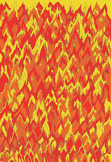
 Fire is by far the hardest thing to draw on a3 scale. it was proper pissing me off.


Heres the new design sheets

I've been experimenting with patterns over the weekend based around 3 of the 4 elements. These are the attempts at finding a pattern i want to work with and develop.


 Some are working better than others and some are just down right shit. In the process tho i'm developing my visualisation skills even if its some simple squigglies.


 Fire is by far the hardest thing to draw on a3 scale. it was proper pissing me off.

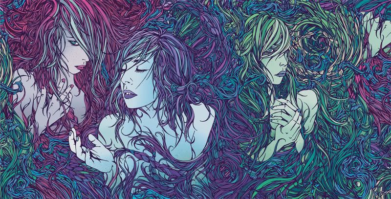
Dan Mumford
Over the weekend i was inspired by Dan Mumford artwork with the intricacies of his line work to create my own patterns around the four elements.

Thursday, 7 May 2009
Design Update 1


Earth and Fire are easily associated with The Thing and Human Torch. However the link between water and wind with Mr. Fantastic and Invisible Women is less obvious.


i'm exploring two ideas now. focusing still on illustration. working with the fantastic four gave me the idea of doing other characters that are associated with the four elements. The associations are on the image below.

EDIT.
I'd been working up The Things vector bottle and it didnt look as good as when produced by hand. I also halftoned it as i mentioned earlier to create the comic book affect.

Tuesday, 5 May 2009
Jonathan Williams


very strong illustration style. i think this could work well for the posters i'm going to produce.
Subscribe to:
Posts (Atom)